The 14th edition of the National Poetry Slam marked my 8th year serving as Creative Lead and Graphic Designer. With a small team and limited budget, we delivered a campaign with great emotional depth.
My role involved leading creative vision and execution across all stages of the competition, from Auditions to Semi-Finals to the Grand Slam, while ensuring cohesion across digital, print, social media, and live production.

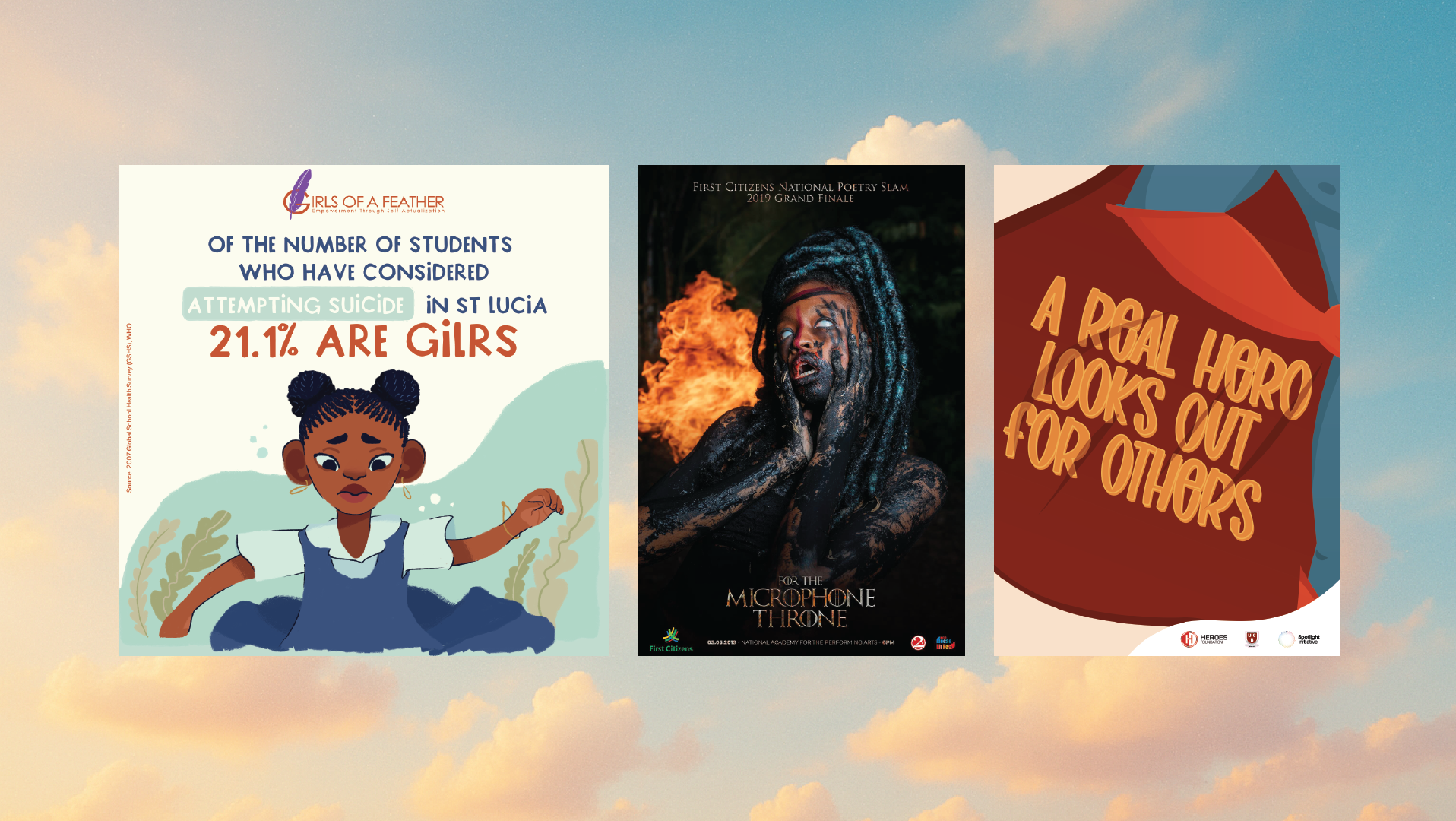
This year's theme, 'Bring It Home', was a departure from previous Slam campaigns. While past themes leaned on cultural or pop references (like For the 'Microphone Throne or 'Enter the Dragon's Mouth'), Bring it Home asked us to strip back the theatrics and dig into something more intimate: growth, memory and reflection. It was a risk: subtler, more abstract, and layered with emotional nuance. However, it became a creative challenge that was fully embraced.
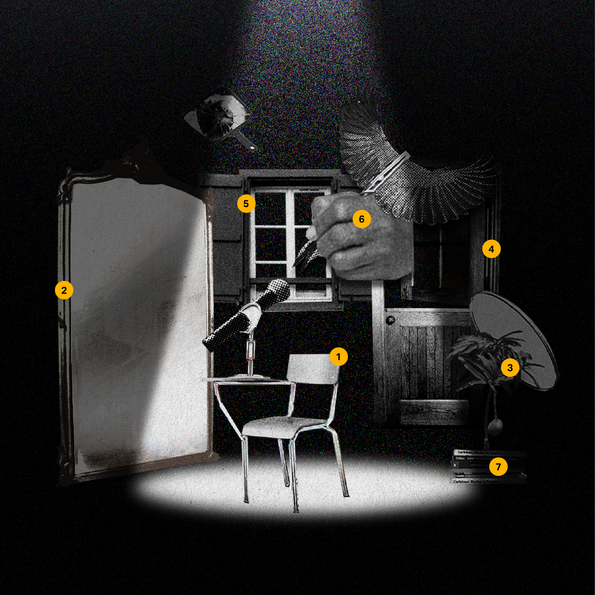
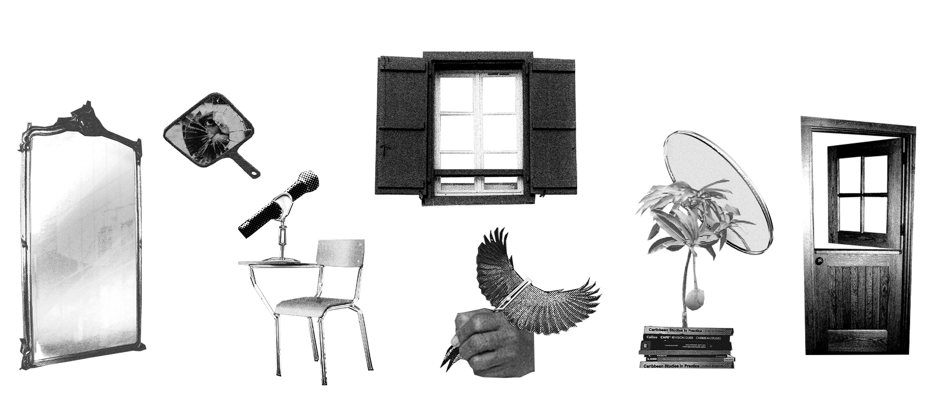
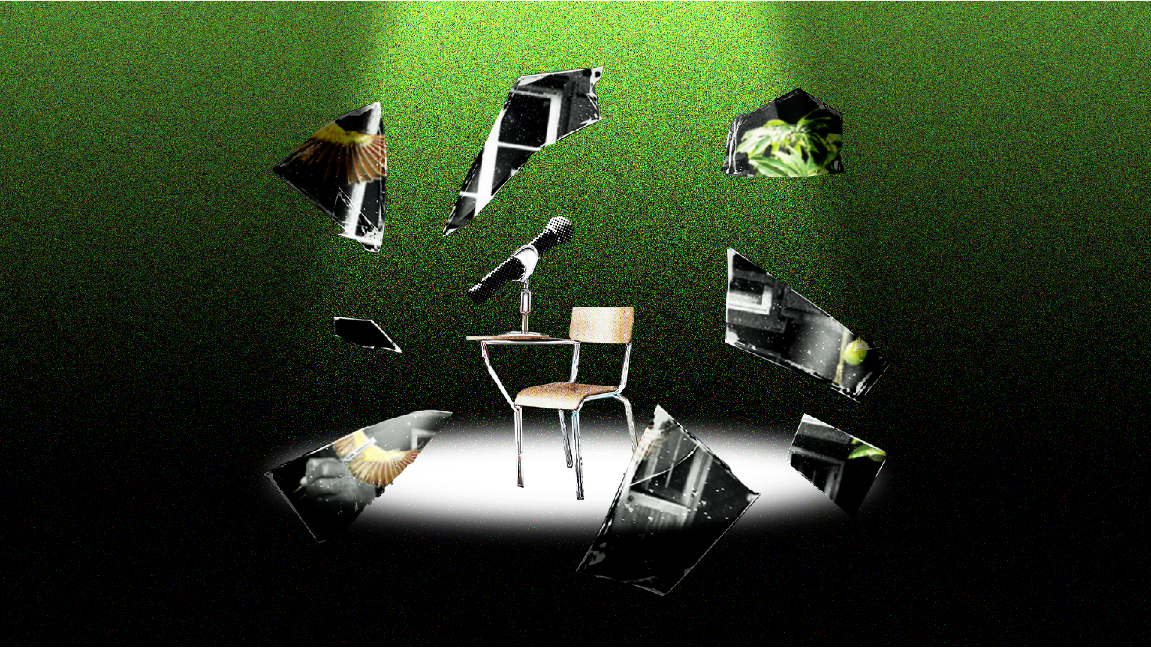
The campaign was built around a single, familiar symbol for slam audiences, a spotlight. From this light, a set of carefully collaged artefacts was showcased:
A school chair and microphone (1), an ornate mirror (2), a mango tree (3), a door (4), a window (5), a kiskadee (bird) mid-call with a pen in its wing (6), and a stack of Caribbean secondary schoolbooks (7).
Each object was chosen for its metaphorical resonance, drawing attention to the fragments of identity and memory that shape a poet's voice.
The visual language evolved with competition, starting in black and white for auditions, shifting to subtle gradients and deeper symbolism for semi-finals, and ultimately culminating in full colour by the Grand Slam.
Supporting the spotlight's storytelling was a bold, titled, and often troublesome-to-work-with typeface, 'Neubahn'. Ultimately, in choosing a typeface and collage style, I aimed to subtly draw inspiration from the Russian Constructivist movement and its unapologetically strong messaging.
Working on the Slam resulted in over 70 assets across three phases: projection visuals, poet videos, and event branding. The real achievement lies in the story that grew in depth and presence over the course of six months.
Creative Direction and Concept Development
The creative direction was centred on transformation. A key to defining the Slam theme is to craft a living design system rather than a static visual identity. A system that could move with the poets and mirror the emotional arc of the competition.
We began with three guiding words: growth, reflection and evolution. These became the backbone of the entire campaign and helped align with the 2025 Bocas Lit Fest Theme, Always Coming Home. From there, working with Bocas to build a concept that honoured the past but embraced the personal, with one aim: to create something meaningful.
Design Process and Execution
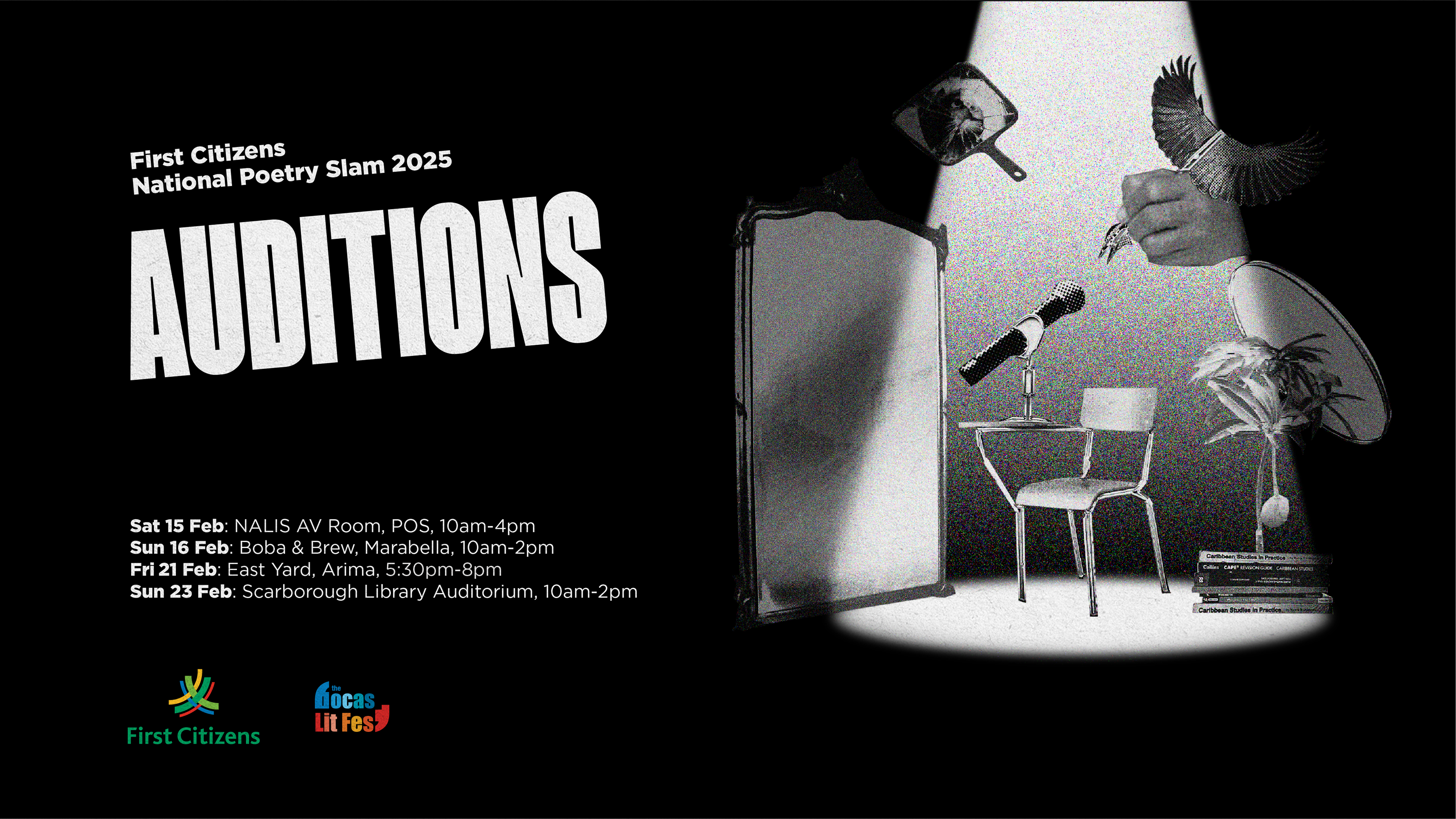
Auditions
The campaign began in black and white, raw, stripped back and full of potential. Under the spotlight sat a school chair with a microphone resting on its desk. A Great Kiskadee (bird), collaged as a pen mid-flight, performed directly into it. Symbolising the poet as both witness and writer.
To the right, a young mango tree, already bearing fruit, is stacked atop Caribbean school textbooks and is reflected in a mirror. This composition nods to the wisdom and power that can emerge from youth, where growth and maturity do not wait for permission. On the left is a large ornate mirror, anchoring the composition and inviting the viewer to see themselves in the poet's place.
Above, suspended in tension, hovers a broken handheld mirror with an eye staring directly at the viewer. This artefact served as a means of communication early in the campaign, symbolising a fractured identity while simultaneously acting as an anchor for connection. Subtly drawing the viewer into the composition. Switching observation into participation.
As it was my first time collaging, collecting, treating, and composing these artefacts, it became a process led by provocation. A call to introspection. Who am I, as the audience, as a poet? What am I bringing to the stage?
The typography for the headline was tilted at a 5-degree angle, with its nod to Constructivist design, where art serves as a means of social progression. The absence of colour asked the audience to slow down, interpret, and reflect.
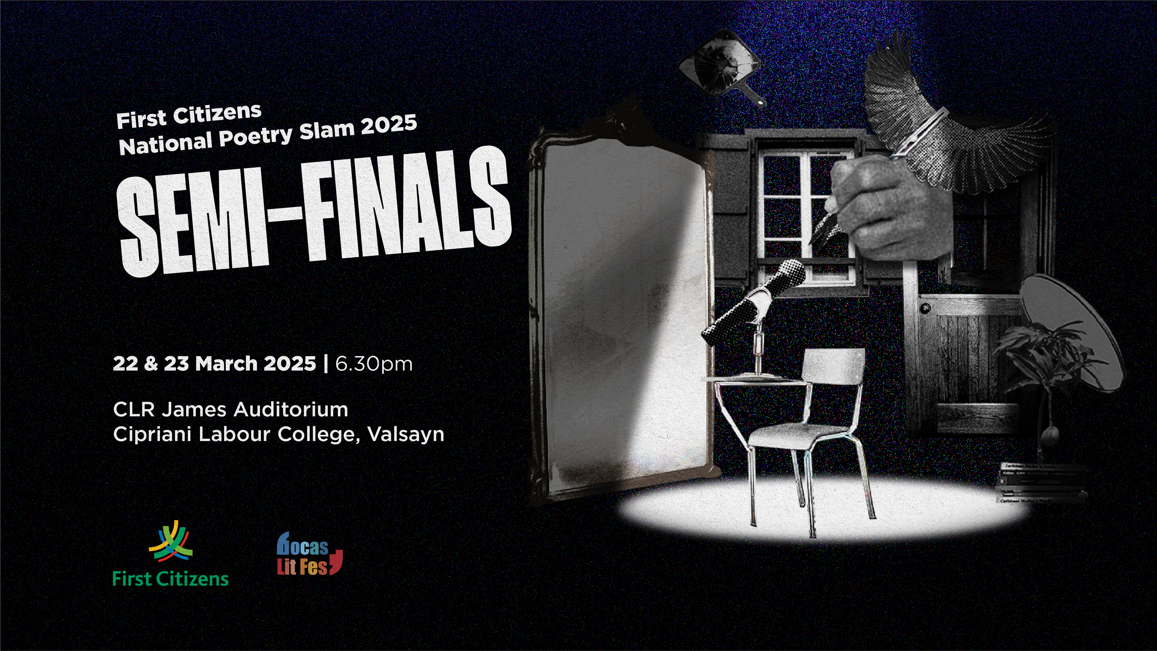
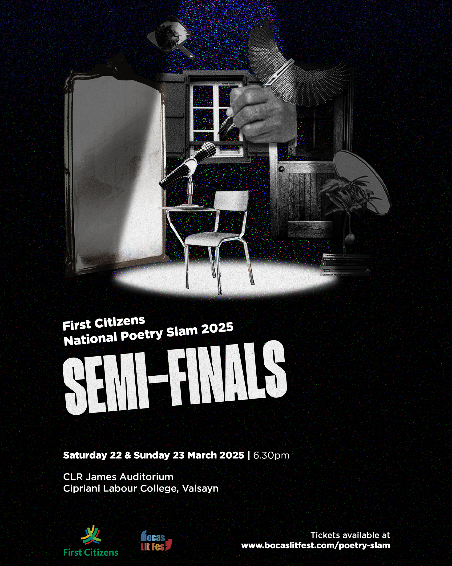
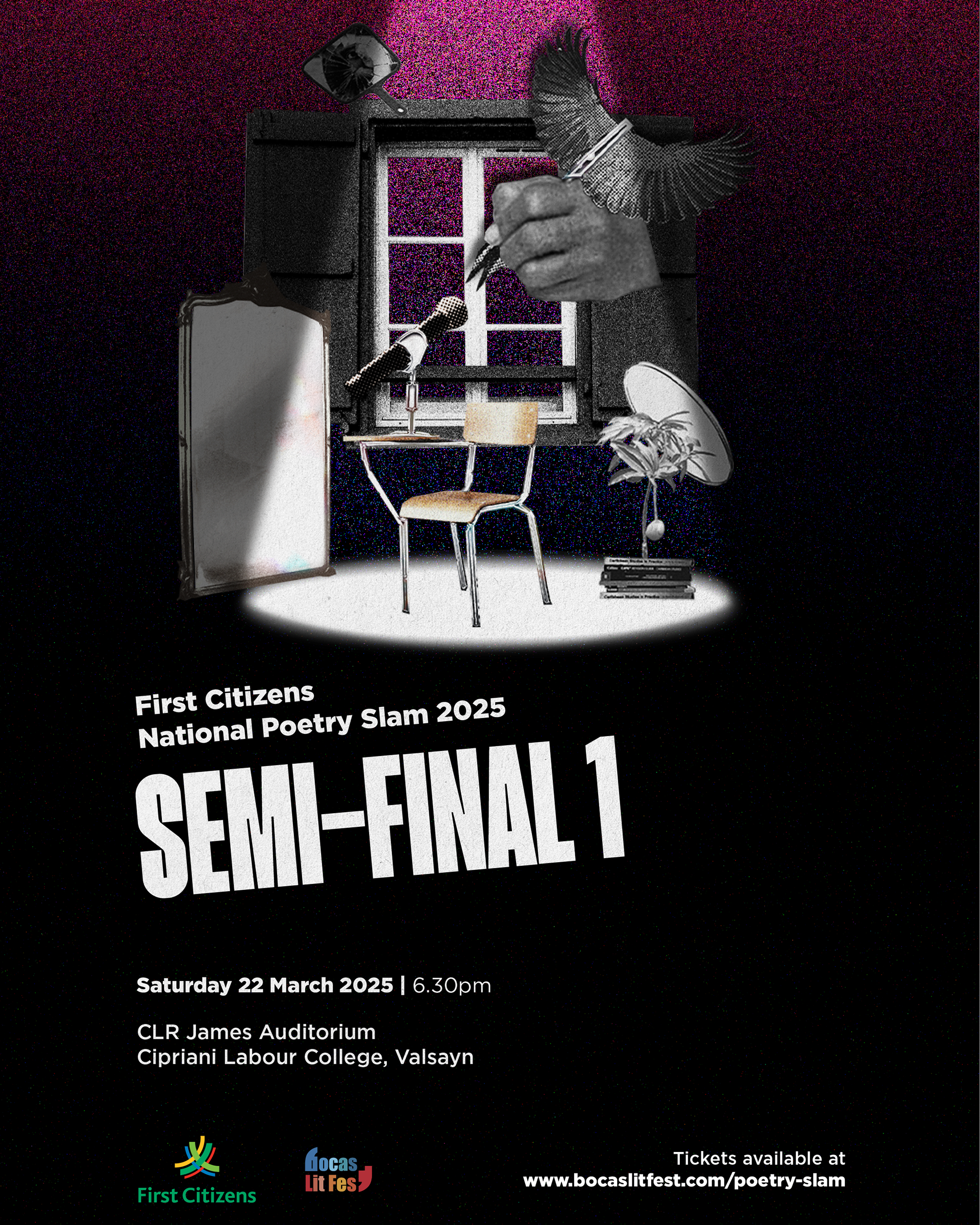
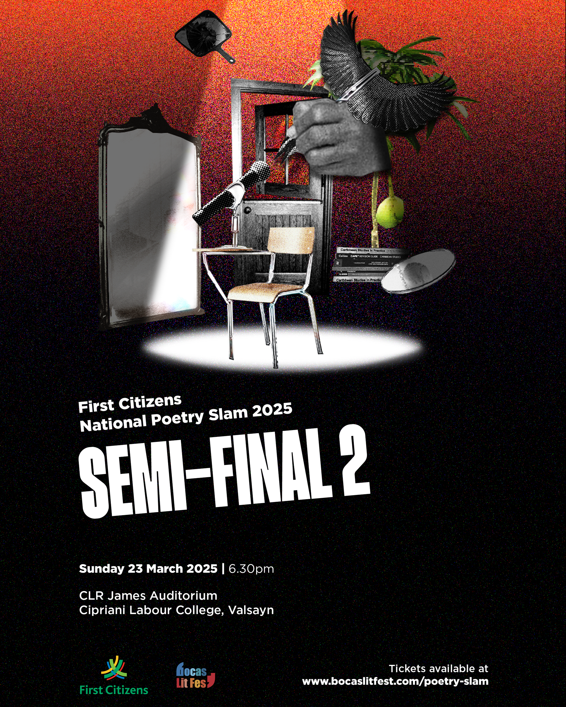
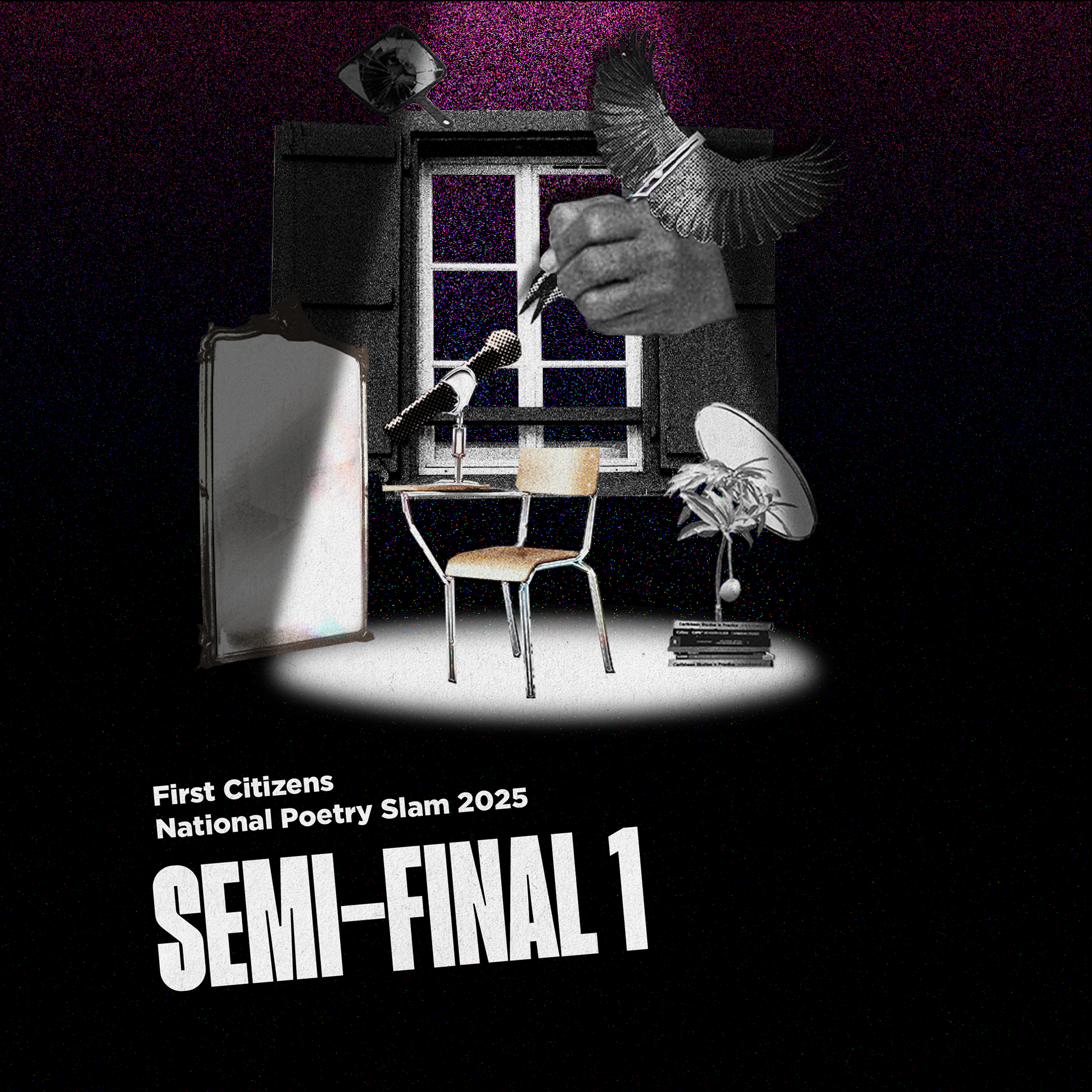
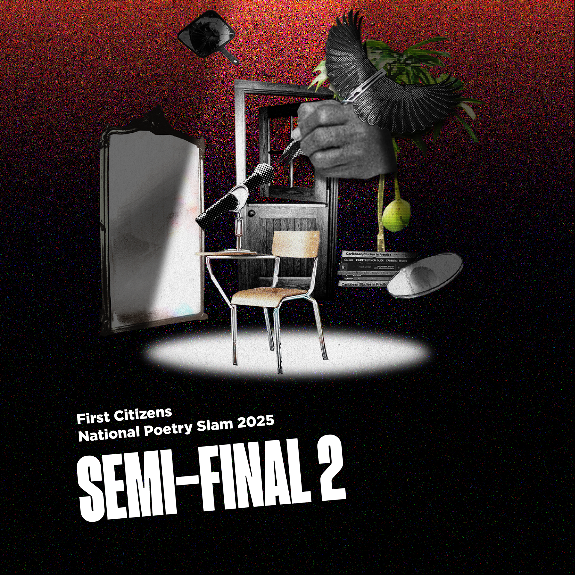
Semi-Finals
For the second phase of the competition, colour emerges gradually through gradients as a visual metaphor for transition. I wanted to subtly reflect the passage of time, from night into early morning. Revealing a gentle shift. Movement between stages of the slam and versions of the self.
Two new artefacts were introduced, each symbolising the semi-final events: a window and a door. The window, a familiar feature of the home, was chosen to encourage a view outward, like a glimpse into possibilities, such as winning 50K TTD, for example, but also a glimpse into clarity and self-awareness. The door represented a decision, a crossing, a commitment to step through and be seen. Here, I wanted symbols that suggested movement and momentum, which I think they do well together, encouraging poets and audiences to push beyond their comfort zone and confront the threshold of growth.
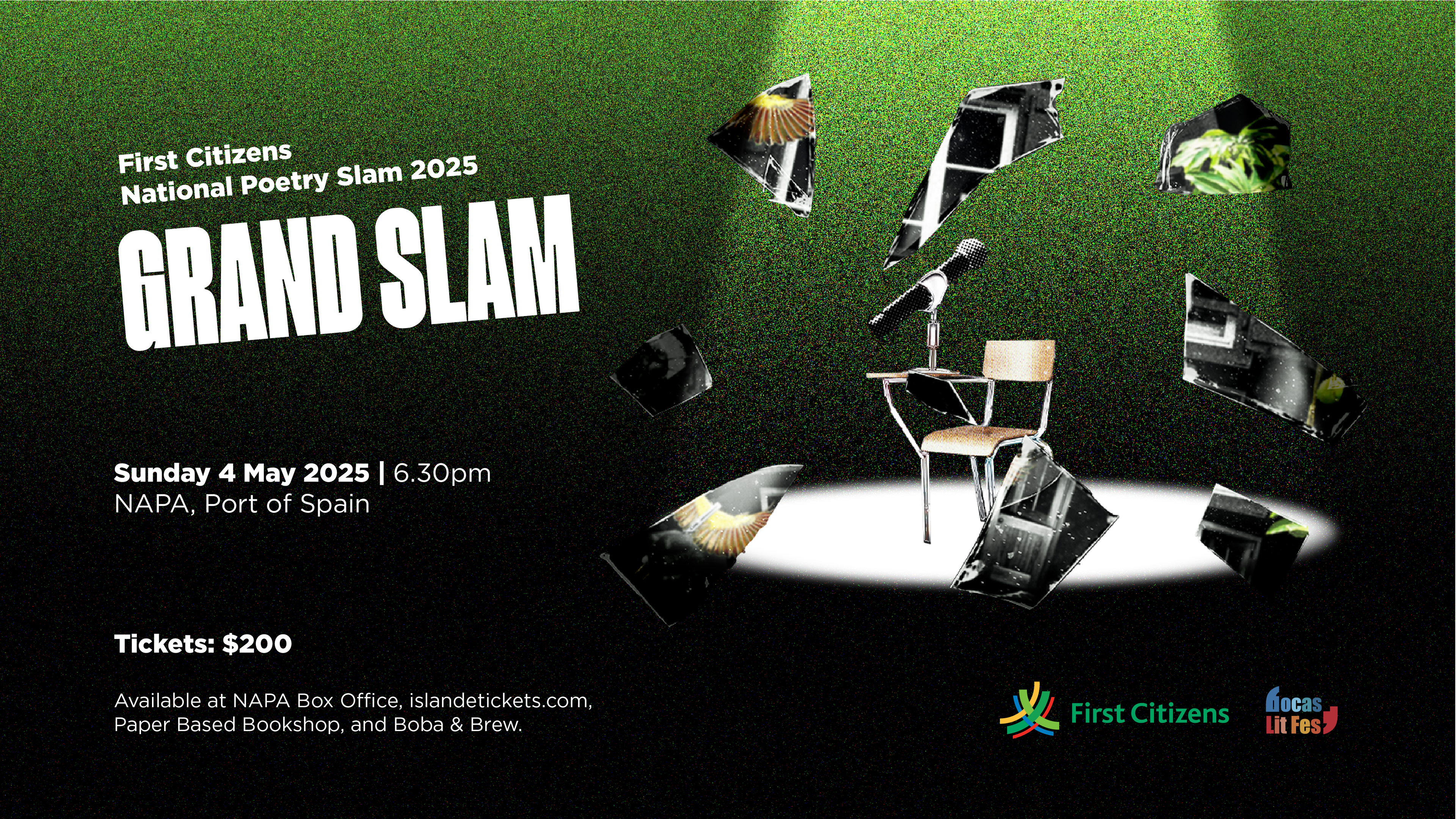
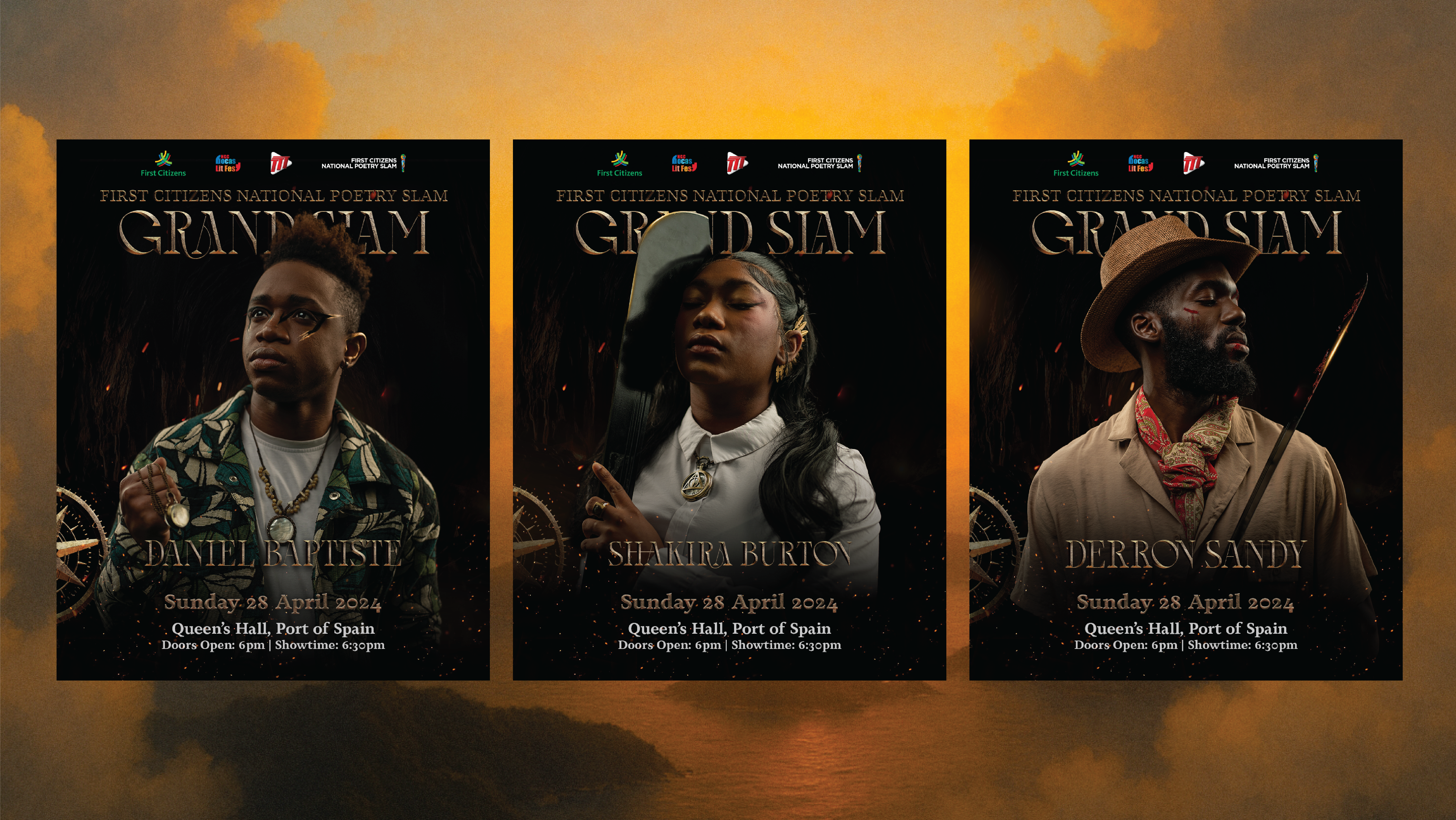
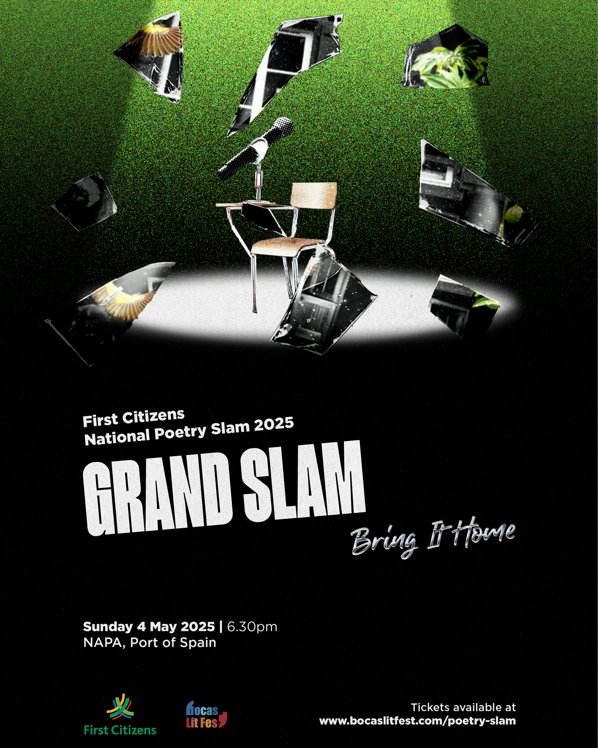
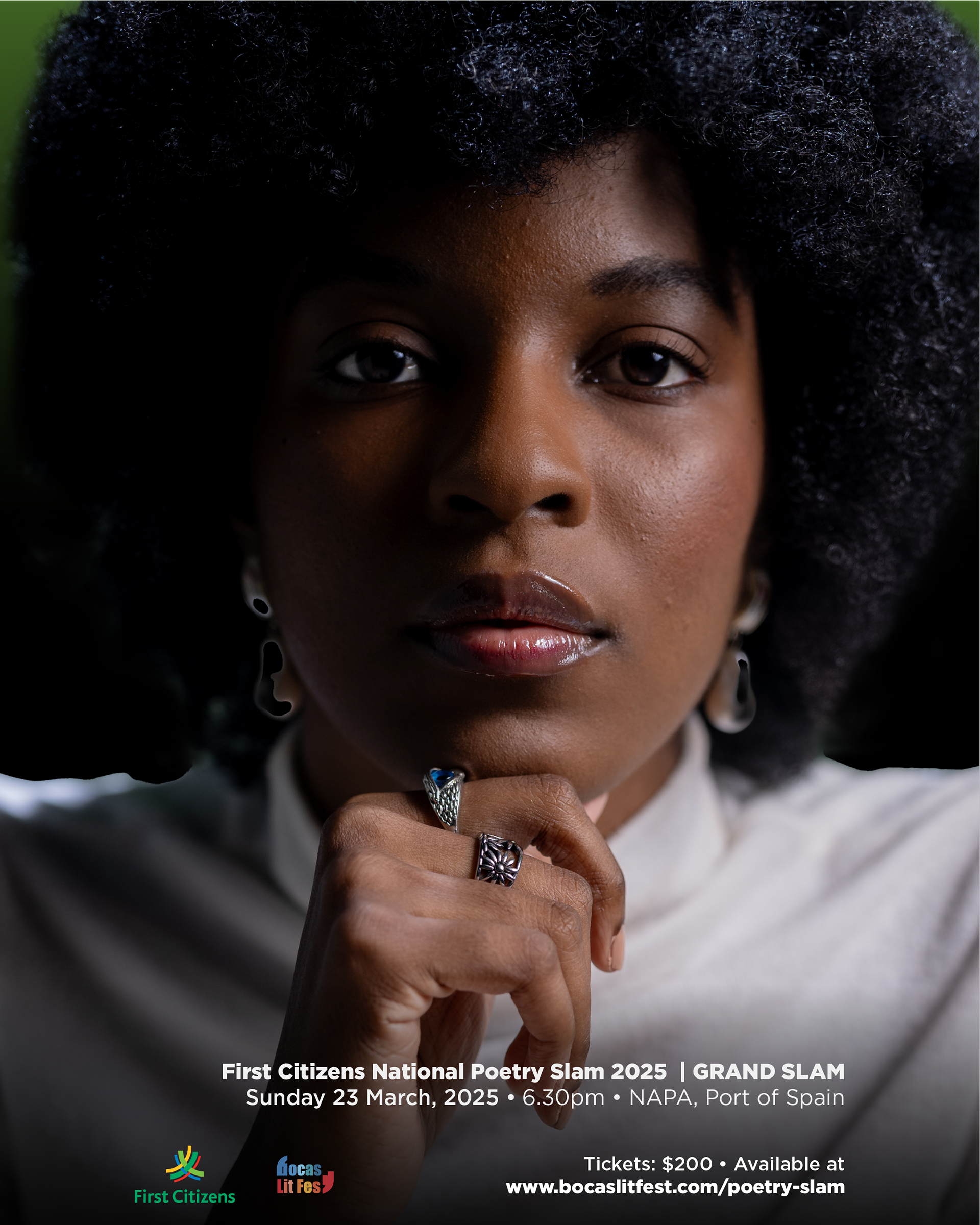
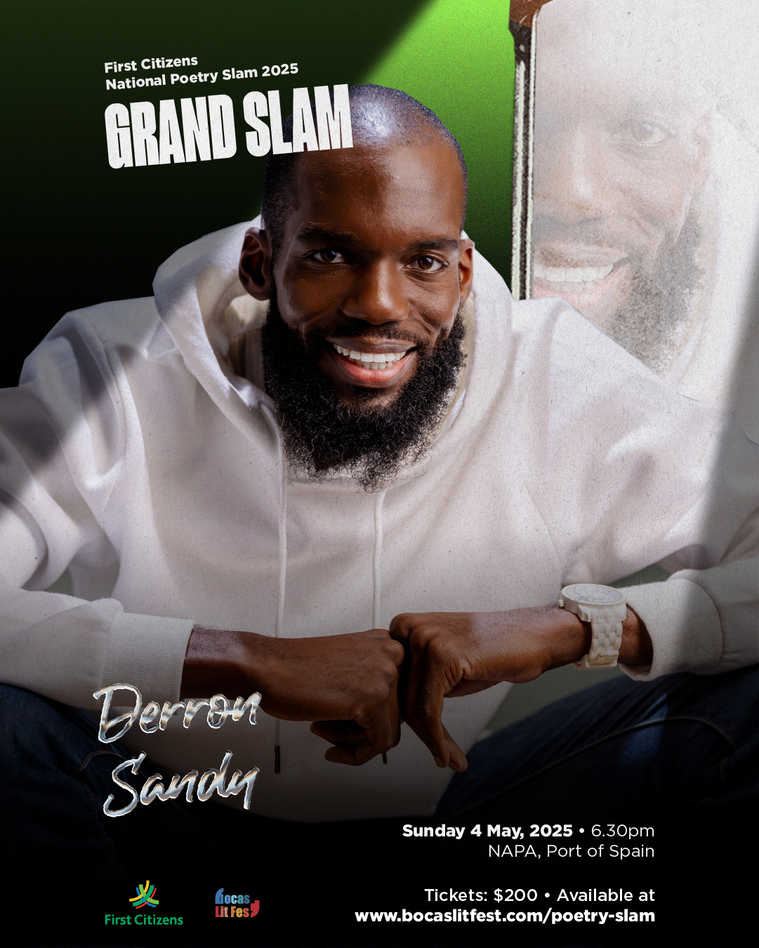
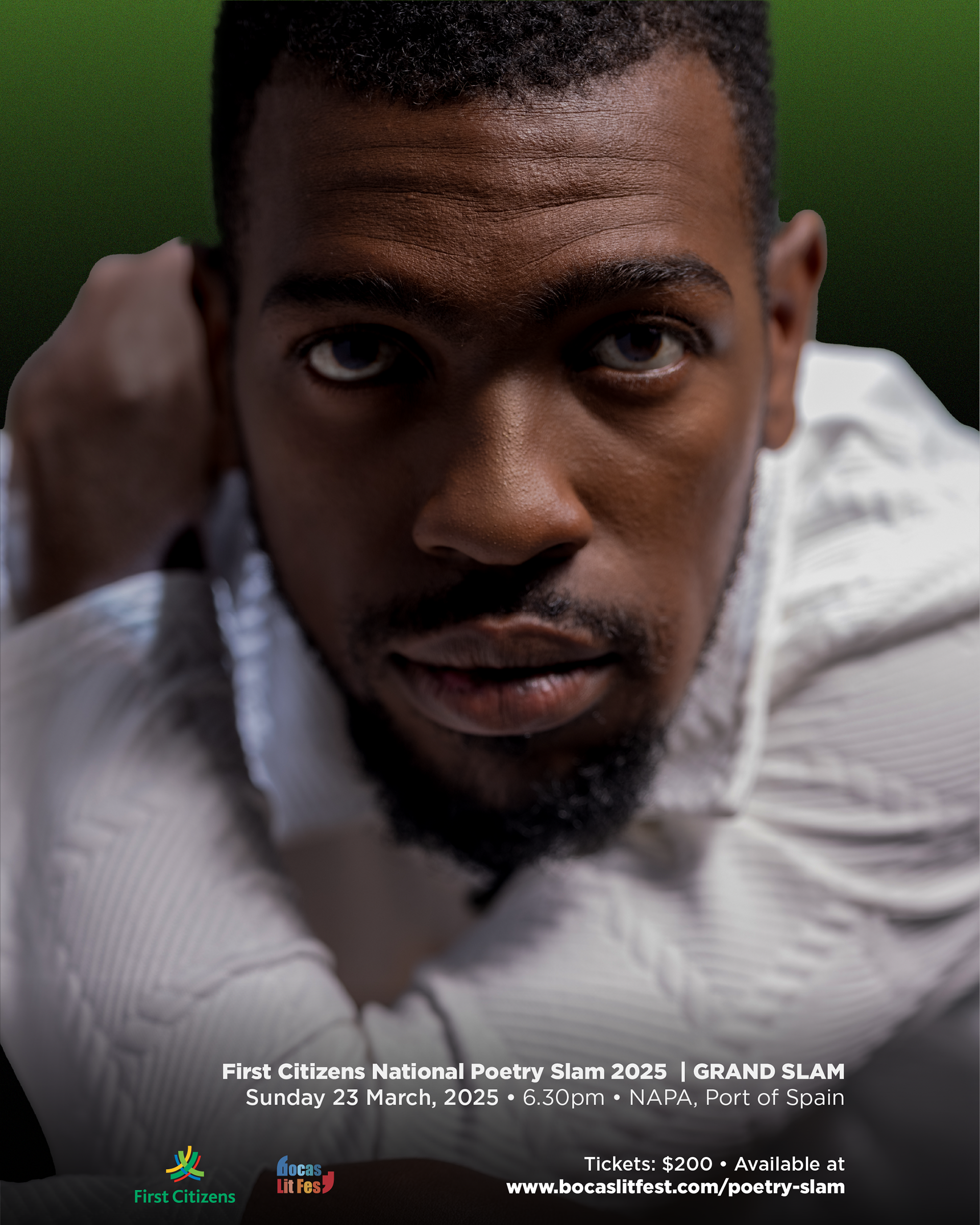
Grand Slam
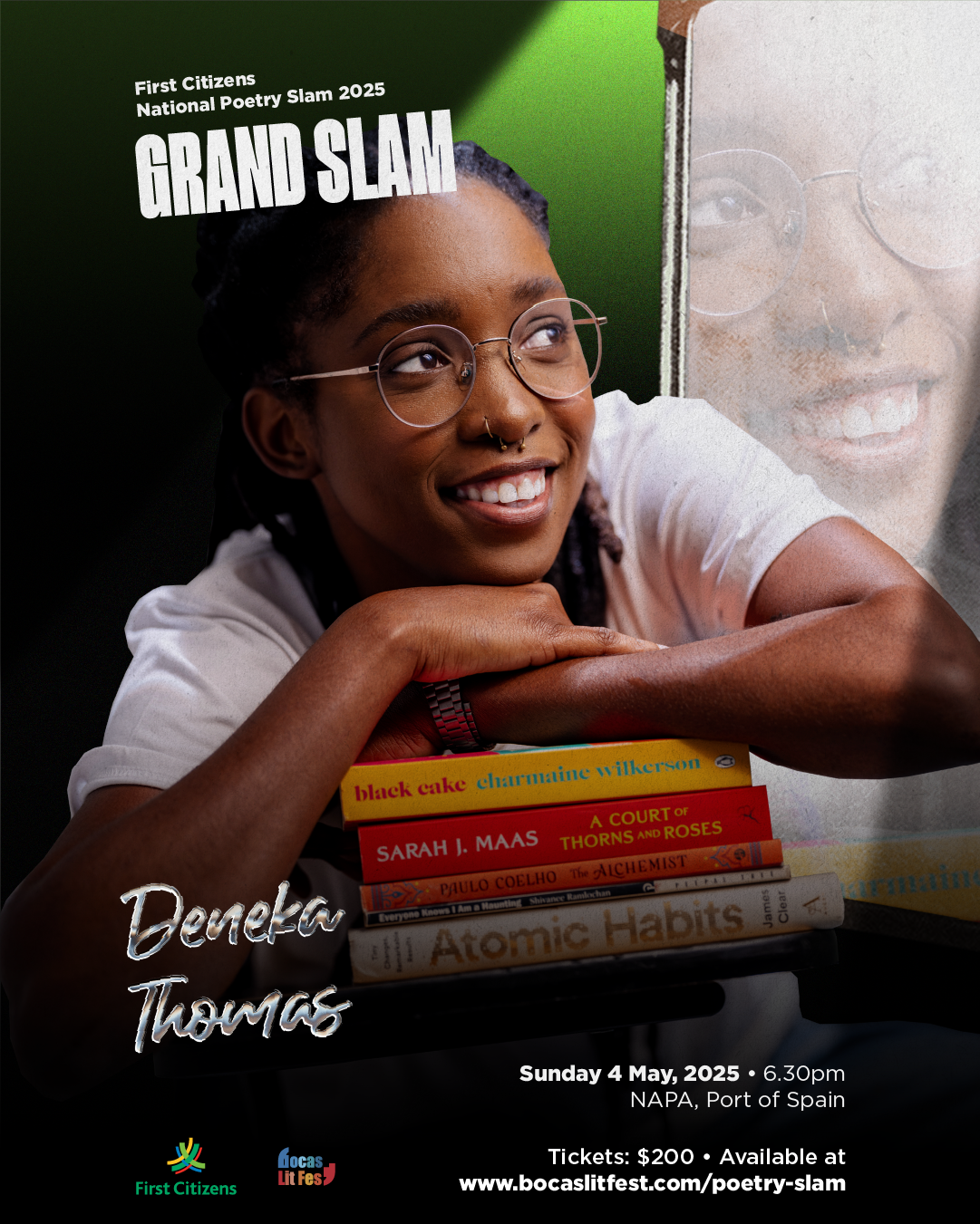
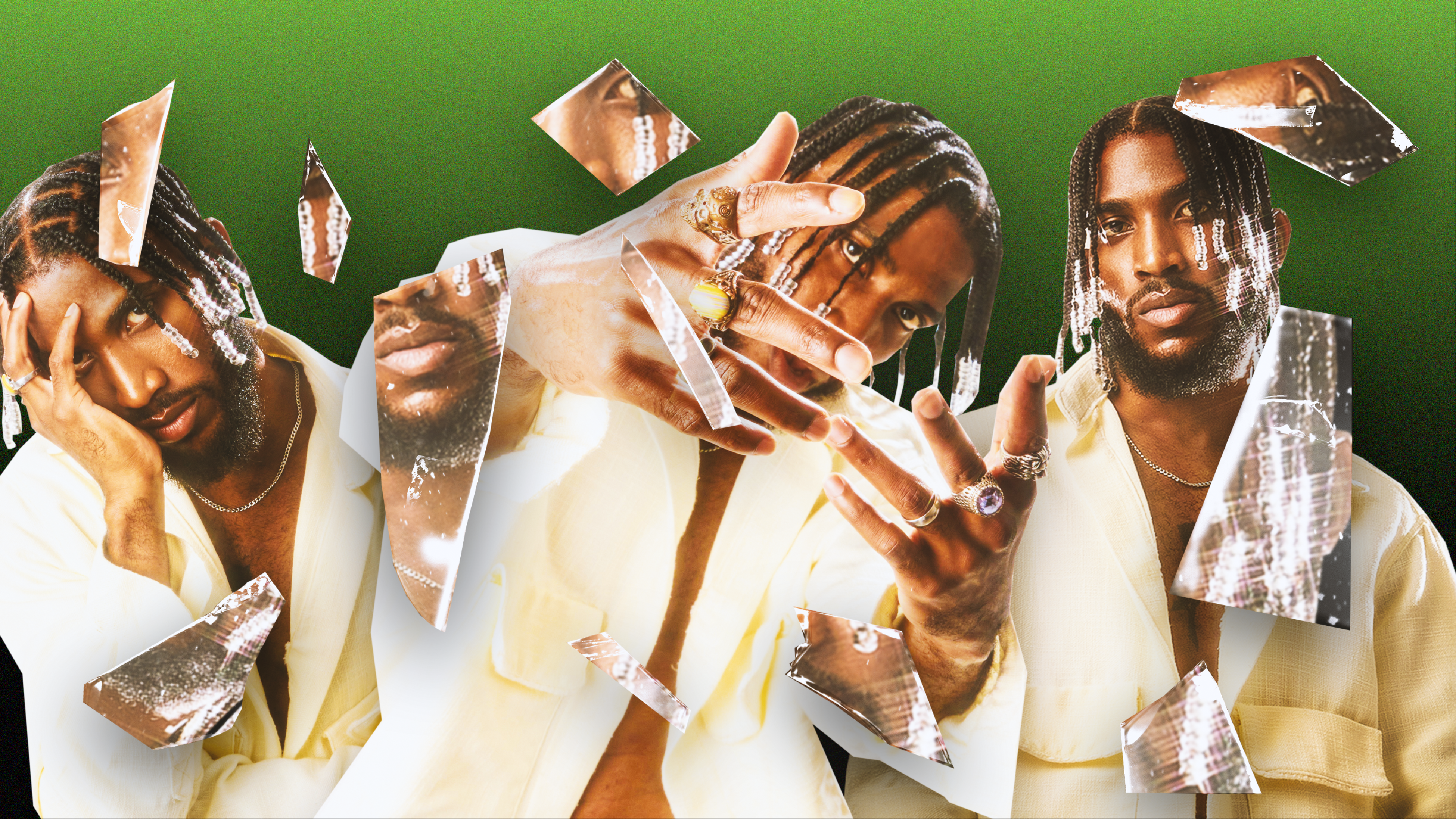
The culmination of the competition is now in full colour. This phase leaned heavily on the broken glass metaphor, subtly shown by the handheld mirror used in previous visuals. Inside the shards are reflections of the journey, the mango tree, the bird, the door and the window. Each fragment represents memory, legacy, and transformation. I wanted to make this all about presence, simplicity, poets at their peak, and a visual that conveys the sharpened voices.
We paired this with documentary-style video portraits featuring poets in white tops and blue jeans, seated in the same school chair and facing a mirror, with an intention for authenticity. For the first time, letting the poet's voice, not the costuming, carry weight.
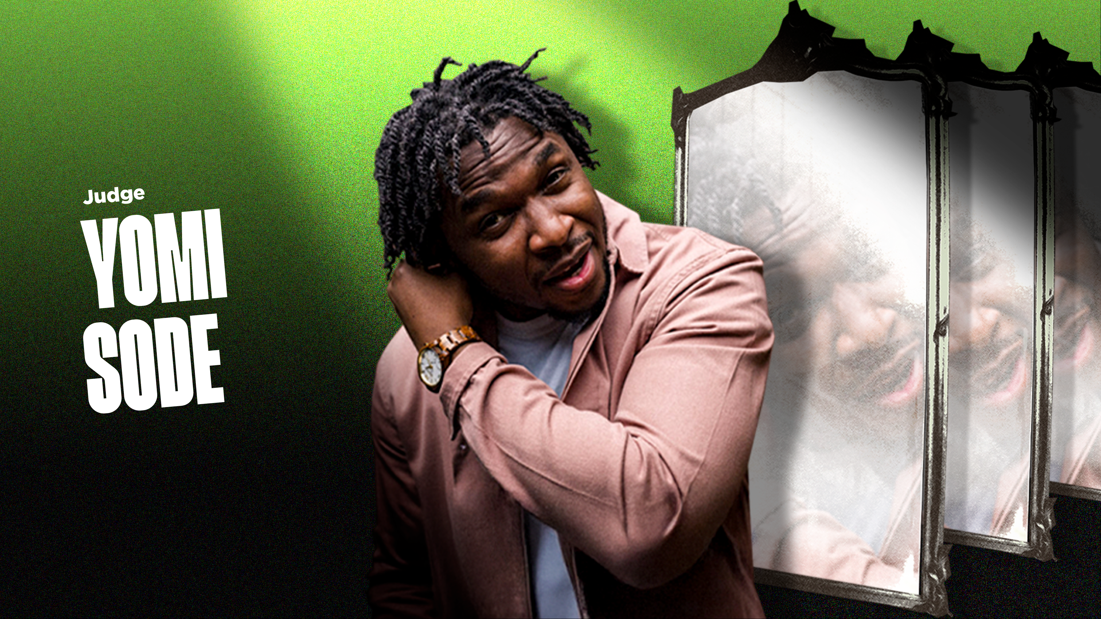
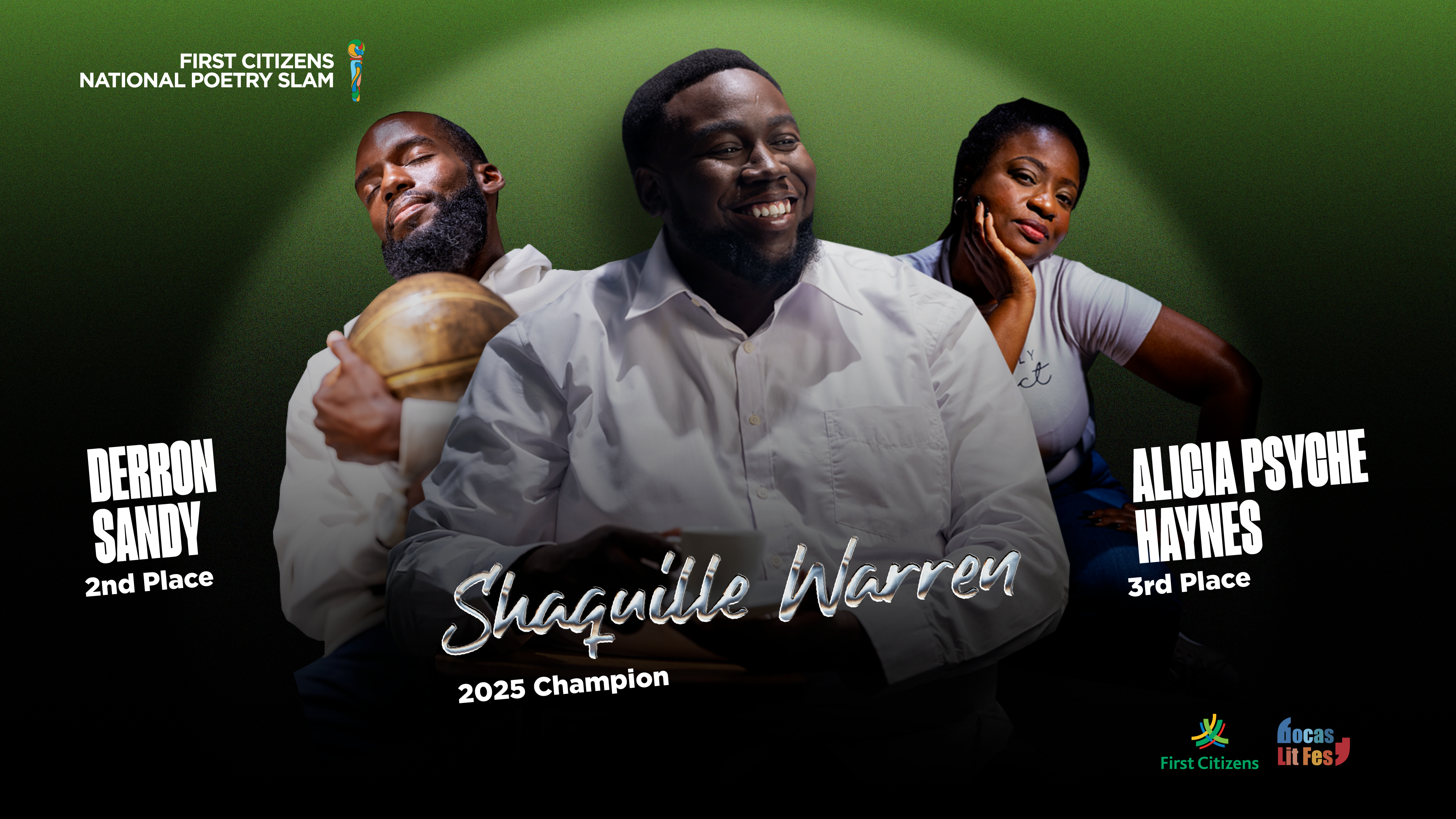
Alongside the visuals, it accompanies a suite of projection graphics designed to carry the energy of the live event. The main banner, projected throughout the show, featured all sixteen poets seated in two rows. Along with the other graphics for hosts, judges, and the guest performer, Jimmy October needed to support the live experience.

Jimmy, for example, appeared in triplicate across shards of glass, designed for motion and intensity. The judges stood against a repeated motif, the mirror, grounding them in the campaign's theme of reflection and recognition.
These were paired with introduction videos of the poets and other visual cues that extended the thematic and emotional arc, stitching the night together. Bringing a story full circle. A single spotlight to a collective moment in celebration.
Reflection
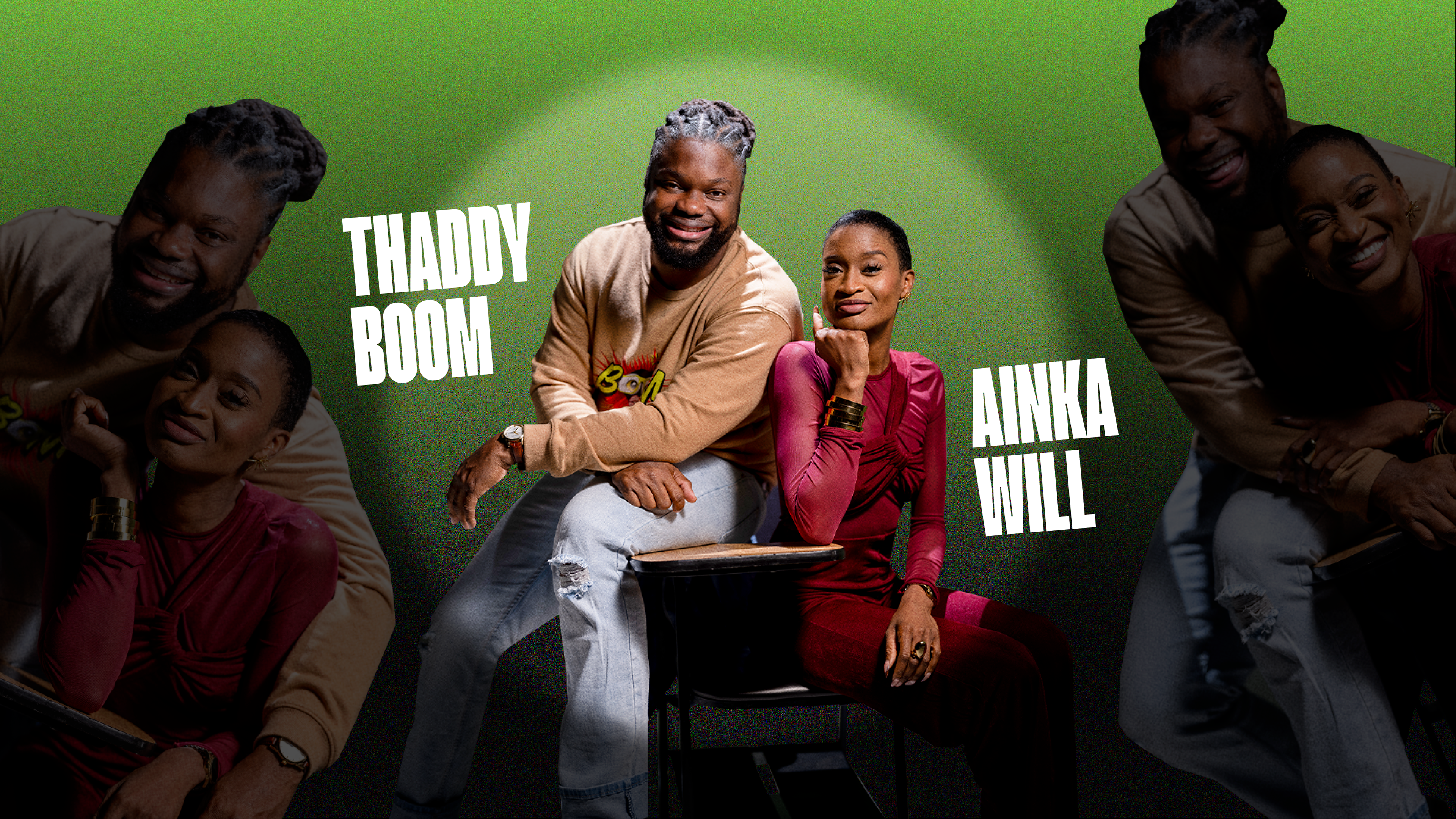
This project pushes each year in ways I never could have imagined. Starting as a teenager, I learn new lessons and each year a new opportunity to try something new. In a way, growth, reflection, and evolution were really for me. Recognition of where I am now in my life, exploring new design styles and what a career as an art director can be like. With a small team. Atiya Douglas and Marielle Forbes as project managers, Alette Liz Williams, Jayden Phillip and Anisha with PR and socials. I am excited about the 15th edition and going BIG.
This would also not be possible without the support of the Bocas Lit Fest, which allows poets to shine. Creatives like Stephan Rampersad (Motion Design), Curtis Henry (Photo/Video), Vincent O'Neil (Videography), Mikhail Gibbs (Videography), and I, well, have fun.